
Microgrid Controls Platform ︎︎︎
A software-based intelligence platform used to monitor, control and optimize energy usage.
01. Project Brief
My Role The Team Project Timeline My Key Contributions
UX Design Strategy Lead Sep 22 - Jun 23 Ideation
UI Design PM/Energy Expert User Flows & Wireframe
UI/UX Design Prototyping
Data scientist Usability Test
Developers Interaction Design
Interface Design
UI Design PM/Energy Expert User Flows & Wireframe
UI/UX Design Prototyping
Data scientist Usability Test
Developers Interaction Design
Interface Design
Background
Climate and energy problems are accelerating
and their impact is intensifying. The shortcomings
of current solutions exacerbate these issues and
create even greater problems for customers.
and their impact is intensifying. The shortcomings
of current solutions exacerbate these issues and
create even greater problems for customers.
Problem
Businesses struggle to extract
value from their onsite Distributed
Energy Resources (DERs) to
improve energy cost, resiliency, and
sustainability impact. These business
buy many renewable solutions, but they
don’t work together and vendors pass
that complexity to end customers.
value from their onsite Distributed
Energy Resources (DERs) to
improve energy cost, resiliency, and
sustainability impact. These business
buy many renewable solutions, but they
don’t work together and vendors pass
that complexity to end customers.

Amid challenges,
our team noted a
surge in demand for orchestration solutions
Solution
An easy-to-use orchestration platform with
an integrated microgrid, automating monitoring
and control to optimize energy consumption.
Simplify and unify information, enabling
customers to balance competing priorities
(cost, resiliency, and sustainability)
and make informed decisions.

In a nutshell, I was tasked with

I engaged with the Product Manager to gain an understanding of the project goals. To ensure clarity and alignment, I also communicated regularly with developers and understood their capabilities and technical constraints.
The design approach I adopted:
![]()

Impact
Organizing data structure with complete data chain
Optimizing workflow to increase task completion rate
Enhancing system feedback to reduce error rates
01 - 01
User Research
Interviews
After understanding the problem of
macro-level, we established questionnaires
were created for interviews to collect data
to understand the needs and pain points
of microgrid operation. Both qualitative and
quantitative questions were asked to gain
an understanding of the following:
- What does the value ecosystem of a
microgrid deployment look like?
-How well do current microgrid controls
solutions serve the needs of customers?
-What are the biggest shortcomings of
current microgrid controls solutions?


Interviewees:
Microgrid Installer Technical
Director, Technical Projects
Director of Systems Electronics & Integrati
Facility Management
Microgrid Installer Technical
Director, Technical Projects
Director of Systems Electronics & Integrati
Facility Management
3
Rounds of
interviews
interviews
25
Questions
asked
asked
19
Users
2
Types of
research
“I’ve got 7 different screens to look at...each
one’s giving me different information. I haven’t
seen anybody being able to bring all of that
together into one screen”

Problem # 1
Complex and Diverse
Systems
Many companies focused
on individual components
(batteries, storage, solar).
Dispersed multi-platform
metrics can frustrate facility
operators, and it is affecting
to working towards meeting
energy goals.
Complex and Diverse
Systems
Many companies focused
on individual components
(batteries, storage, solar).
Dispersed multi-platform
metrics can frustrate facility
operators, and it is affecting
to working towards meeting
energy goals.
Problem # 2
A lack of reliable data
severely limits insight
into a system’s operation
Traditional building
managements systems and
meters rely on manual energy
audits, lacking the data needed
to detect wasteful energy patterns.
Operators struggle to assess
the system’s and
address inefficiencies effectively.
A lack of reliable data
severely limits insight
into a system’s operation
Traditional building
managements systems and
meters rely on manual energy
audits, lacking the data needed
to detect wasteful energy patterns.
Operators struggle to assess
the system’s and
address inefficiencies effectively.
Problem # 3
Faulty systems, incorrect
settings and poorly
maintained equipment
Facility management is
highly dynamic, and managers
have to micromanage several
daily process. Scheduled
checks conducted too
infrequently mean wasted
time and money. Equipment
that breaks down unexpectedly
thrusts you into reactive
maintenance, which can
create challenges
and unexpected expenses.
01 - 02
Root Cause
After working with the team to learn
about users' problems and contexts,
I found that these problems are
"symptoms". I need to discovering
the root cause of problems in
order to identify appropriate
hypotheses.
I repeatedly ask “WHY” as a exercise
to explore the cause-and-effect
relationships underlying these problems.

Hypothesis # 1
Comprehensive
Connect disparate data sources
into one view and simplifies
data into more manageable chuncks
of information, allowing users
to glean valuable and actionable
insights at any time.
Connect disparate data sources
into one view and simplifies
data into more manageable chuncks
of information, allowing users
to glean valuable and actionable
insights at any time.
Hypothesis # 2
Visibility of system status
A monitoring system checks
all the equipment’s real-time
running status and identify
opportunities for optimal
control strategy based
on current conditions.
Visibility of system status
A monitoring system checks
all the equipment’s real-time
running status and identify
opportunities for optimal
control strategy based
on current conditions.
Hypothesis # 3
Reliable operability
Always enable users to diagnose
issues and keep them informed
about what has happened, when
it’s happened, and why. Through
appropriate feedback with a
reasonable time.
Reliable operability
Always enable users to diagnose
issues and keep them informed
about what has happened, when
it’s happened, and why. Through
appropriate feedback with a
reasonable time.
02 - 01
Define Users
There are three types of users to solve for
The Facility managers goals are (Primary users):
1. Ensure smooth facility operations and maintenance
2. Maximize energy efficiency and minimize costs
3. Quick & easy to manage service to resolve issues that arise
The energy & sustainabiilty directors goals are:
1. Driving positive environmental and social impacts
2. Foster transparency through reporting and disclosures
The financial directors goals are:
1. Optimize financial performance and profitability


03 - 01
Why did we
choose the
dashboard to
address these
issues?
because facility operators were occupied, they sought a singular
system to facilitate effective decision-making.
system to facilitate effective decision-making.

03 - 02
Appropriate
Data
In a world overwhelmed with data, reduced
complexity provides clarity was a complex
task for me. Presenting only the most relevant
data on dashboards is essential—the more
information we display, the harder it is for
users to find what they need.
Other challenge for me was serving multiple
personas. So I decided to explore the data
based on our primary users - Facility managers
as a started point to understand where their
needs overlap and where they diverge.


03 - 03
Tells a
clear story
I want to be able to connect data to its context
in the business and to answer the viewer’s
questions. This is where the visual layout of
a dashboard plays a crucial role. So I tried
many options to decide which one
performance better.

03 - 04
User Flow
Based on the previous steps, it is very clear what
are the necessary features, actions, and information.
Thus,I jumped straight into out the user flow,
questioning and making revisions, until it is logical.


04 - 01
User Testing
Let’s get feedback
Before the team jumped into implementation, we
ran usability tests on the product to see how
users interact with it.
Using a series of tasks, we wanted to learn what
our participants first impressions were, if they
could navigate the site, if they understood how
to use the dashboard, and really just observe
their reactions and task completion time.

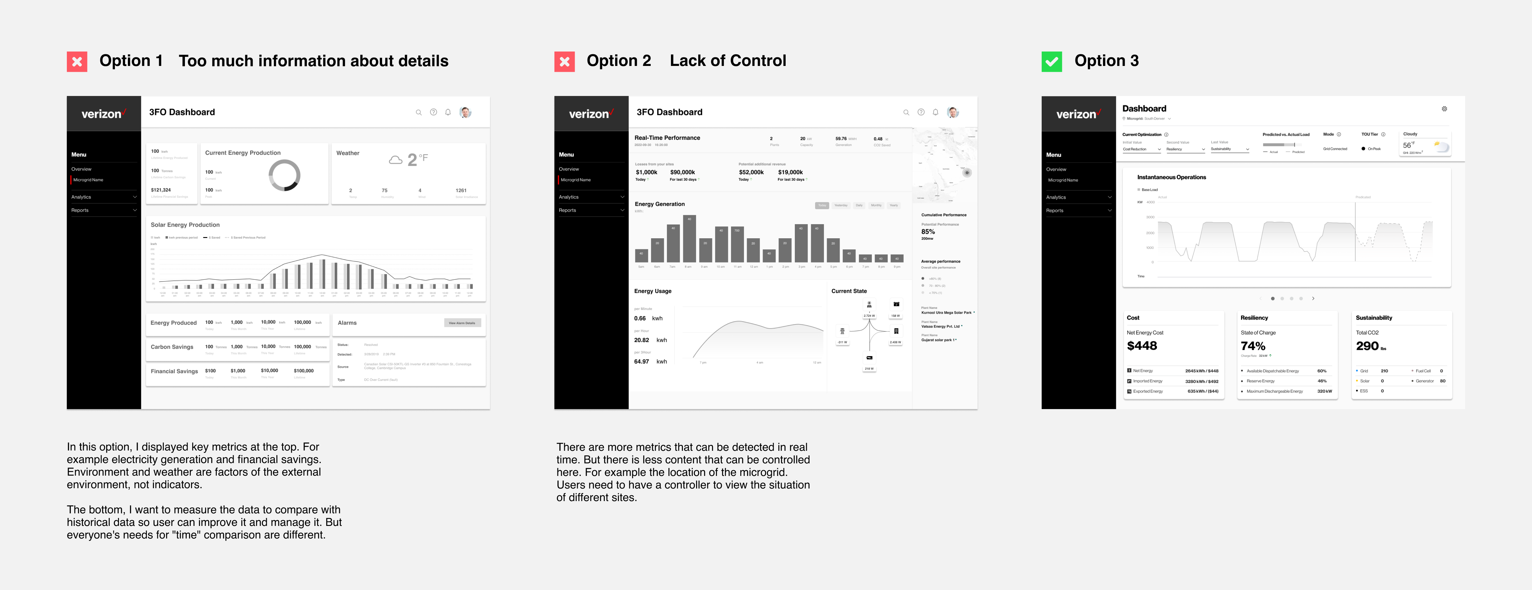
Ding ding ding!
Round 1!
Key Takeaways:
- Information and presentation is generally “on target”. Simple, clean
and intuitive stood out.
- Date Range and its applicability to other elements on the Dashboard
is not clear.
-Graph is busing. Shading is not helping the informaton presentation.
Not functional.
Change 1 # The top bar serves both
the display of the state and the filter
the display of the state and the filter
Before Testing
After Testing

The top section is doing 2 jobs. It’s
giving you information about the current
state to the right. Then to the left, there
is the date range and 3FO optimization
settings are related to the graph below.
When users think “At a glance”, it should
be only showing current information. And
settings should be in other areas to help
user to set all the information for the rest
of the page.

I changed the visual hierarchy for
adjustment. The at a glance section
is to summary information. What’s
happen today.
The day range placed as a filter to
give user context of what timeframe
that they’re looking at. I also provided
historical data for user to compare data.
adjustment. The at a glance section
is to summary information. What’s
happen today.
The day range placed as a filter to
give user context of what timeframe
that they’re looking at. I also provided
historical data for user to compare data.
Change 2 # Mixed information
all together for 3 personas
all together for 3 personas
Before Testing
After Testing

The dahsboard supposed to be used
by 3 different personas. Facility manager,
Sustainability director and financial
director. But all the information is displayed
on a panel, and 3 types of users need
carousel to find the information they
need. I mixed a lot of things all together.
by 3 different personas. Facility manager,
Sustainability director and financial
director. But all the information is displayed
on a panel, and 3 types of users need
carousel to find the information they
need. I mixed a lot of things all together.

So I added a view selector. Tabs are
organizational components that group
content an allow users to navigate its
display. Use them to separate content
when the content is related but doesn’t
need to compared.
organizational components that group
content an allow users to navigate its
display. Use them to separate content
when the content is related but doesn’t
need to compared.
Ding ding ding!
Round 2!

Key Takeaways:
- Really liked the graph and the information presented.
-Likes 3FO as a possible anchor platform for other energy
projects. Possible platforms of platforms.
Change 3 # Understand Why
Before Testing
After Testing

During the interview process, facility
managers talked about their tasks. And
one of their issue is they need to spend
time to do research to finding out energy
spikes (unusual situations) and why.

I added a section to give a quick view
of 3FO issued guidance and microgrid
operations that are occuring so they
have an understanding of what, why
and how 3FO is managing their microgrid.
05
What I’d do differently?
01. Using Thresholds to Stay on Top of Goals
The current dashboard design present a
comprehensive real-time overview of user’s
microgrid production and consumption so they
understand how their microgrid operating at this
instance. The high level information would give
them a wealth of digestible information.
Problem
In reality, facility management set up different
goals for reducing carbon footprint, budgets,
and power effiency for everything from routhine
maintenance to big building projects. That means
they have different thresholds for time-sensitive
tasks, then they can’t afford to skimp out
on thresholds.
Solution
Visualize progress in real time to track their goals
against current performance so they can make
adjustments when they matter most. Thresholds
ensure that nothing falls through the cracks.
