Archive Dive ︎︎︎
01. Project Brief
My Role The Team Project Timeline My Key Contributions
Design Lead Producer Feb - May 2021 Project Management
UX Design Designer User Research
UI Design Developer Define Problem & Wireframe
Prototyping
Interaction Design
UI Design
UX Design Designer User Research
UI Design Developer Define Problem & Wireframe
Prototyping
Interaction Design
UI Design
Find personal relevant
African American
History Makers
This is an experience to motivate young people to
dive deeper into African American stories. We design
to find personally relevant video recordings of African
American history makers.

Our Client
The historyMakers is a national non-profit research and
educational institution committed to preserving and making
widely accessible the untold personal stories of both well-known
and unsung African Americans.
They contain a database of 150,000 stories from almost
3000 historymakers.

How might we build a fun, interactive, and attractive experience for users to find recording and personal narratives?

Design for everyone
02-02
User Research
Key Insights from Users Research
In order to learn more about the current young people’s
interest in history and African America culture. I invited
young groups of different races between the ages of
20-29 to participate in the interview. And invited them
browse the history maker website.


Insight # 1
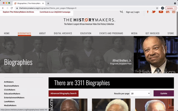
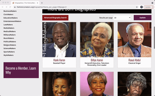
A Large Amount of Content
![]()
A lot of young users do not know where to start because there is
so much information presented on a single page and there are more
than 3,000 history makers. Usually the user just clicks the first couple of
history makers and never has the patience to see the rest of the
history makers information.
Solution: Provide users with good eays to get started. And provide clues
to help a user decide how to start the explore process.
A Large Amount of Content
A lot of young users do not know where to start because there is
so much information presented on a single page and there are more
than 3,000 history makers. Usually the user just clicks the first couple of
history makers and never has the patience to see the rest of the
history makers information.
Solution: Provide users with good eays to get started. And provide clues
to help a user decide how to start the explore process.
Insight # 2
Hard to Make a Choice
![]()
It’s really hard for them to find history makers that are related to
their own interests. Because of the limited display information and
search functions.
Solution: Transform the archive’s data and content in
a way that helps a broad range of young people realted to
the stories and people.
Hard to Make a Choice
It’s really hard for them to find history makers that are related to
their own interests. Because of the limited display information and
search functions.
Solution: Transform the archive’s data and content in
a way that helps a broad range of young people realted to
the stories and people.
02-03
From Findings
to Features
For the final piece of the design, I decided to design the
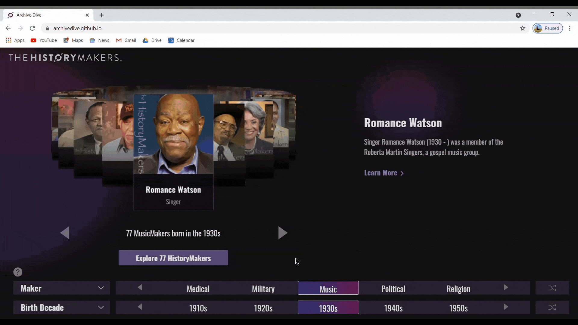
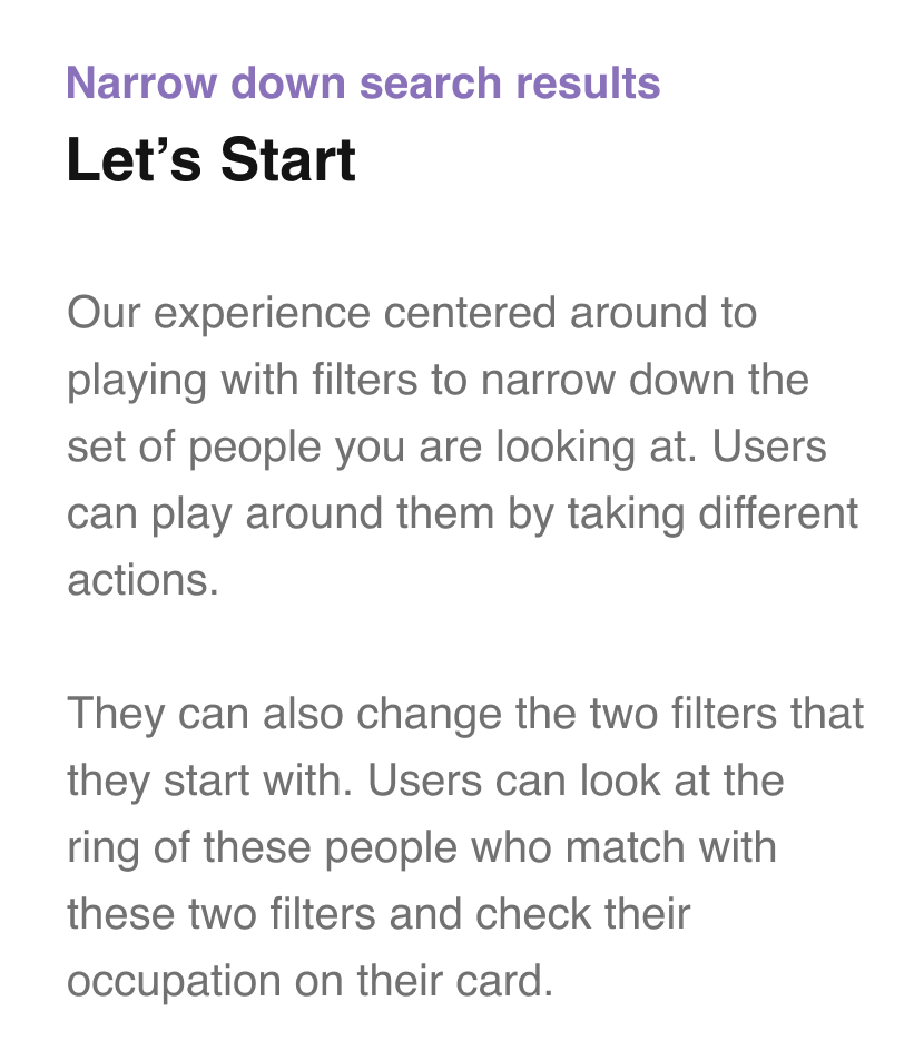
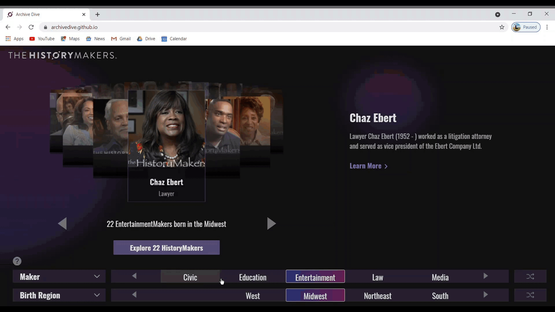
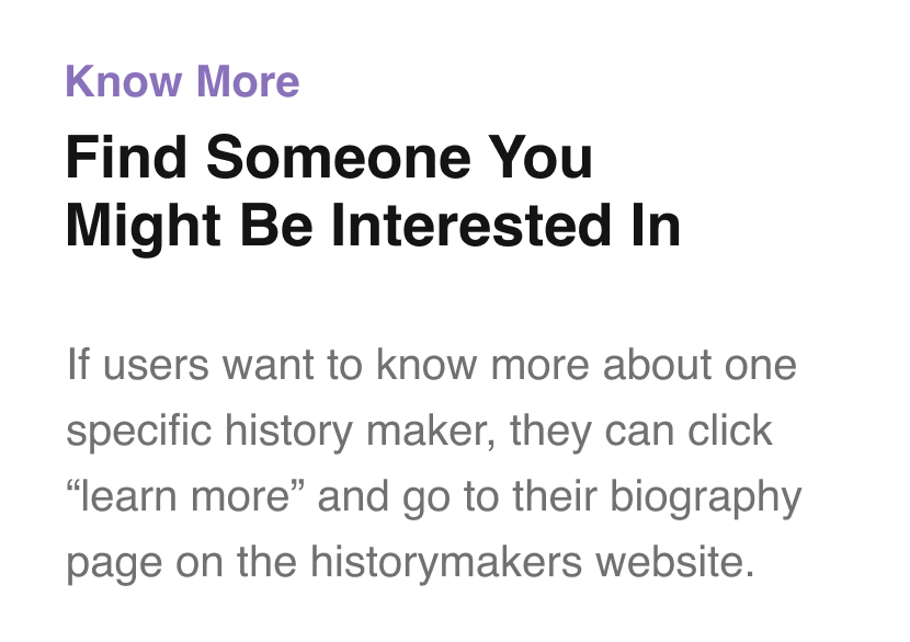
entire experience process as a parallel experience.
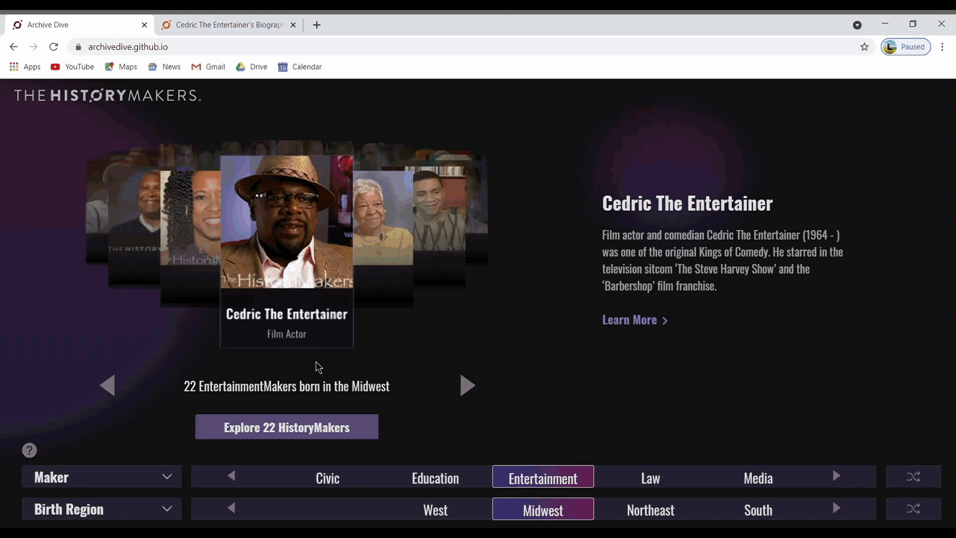
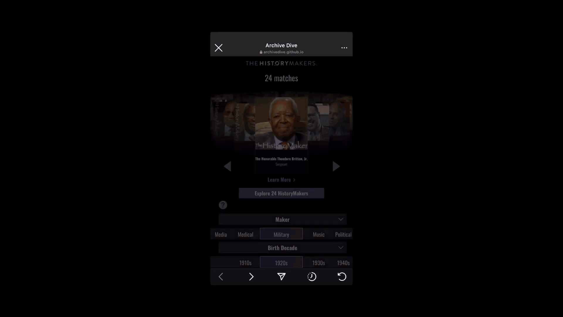
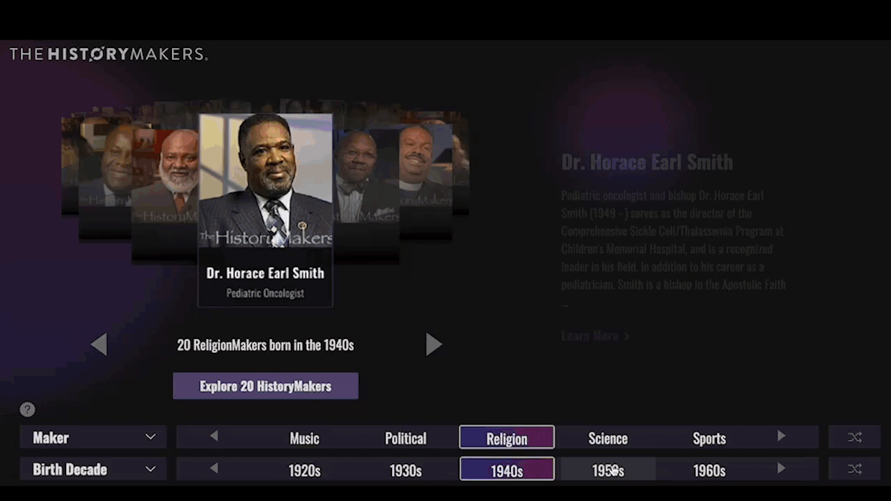
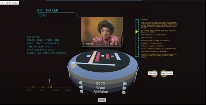
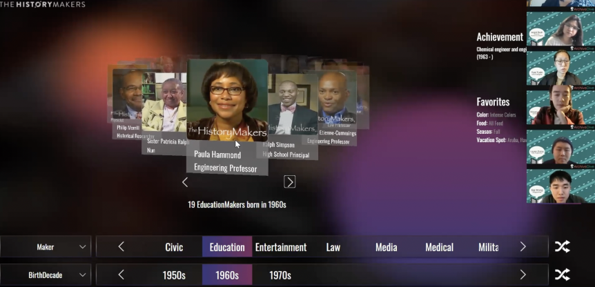
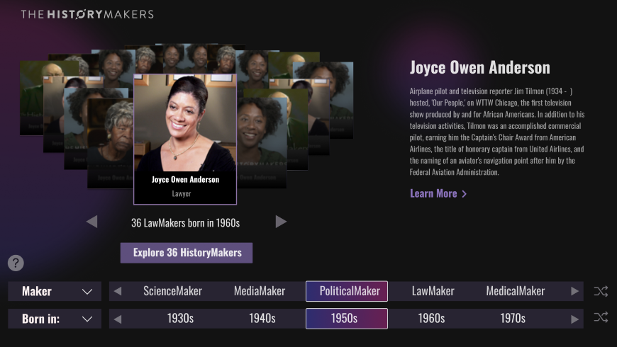
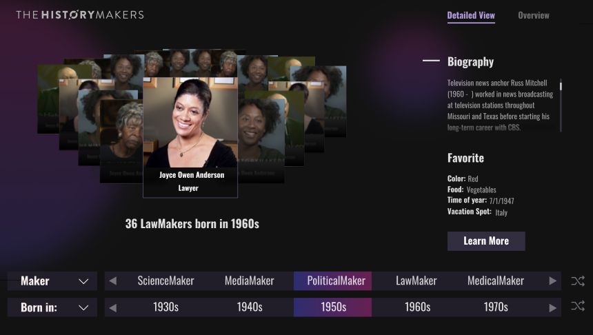
Detail View - 4 filters to help users narrow down their
interested people. View an interactive data visualization of
the set of HistoryMakers that match the chosen filters.
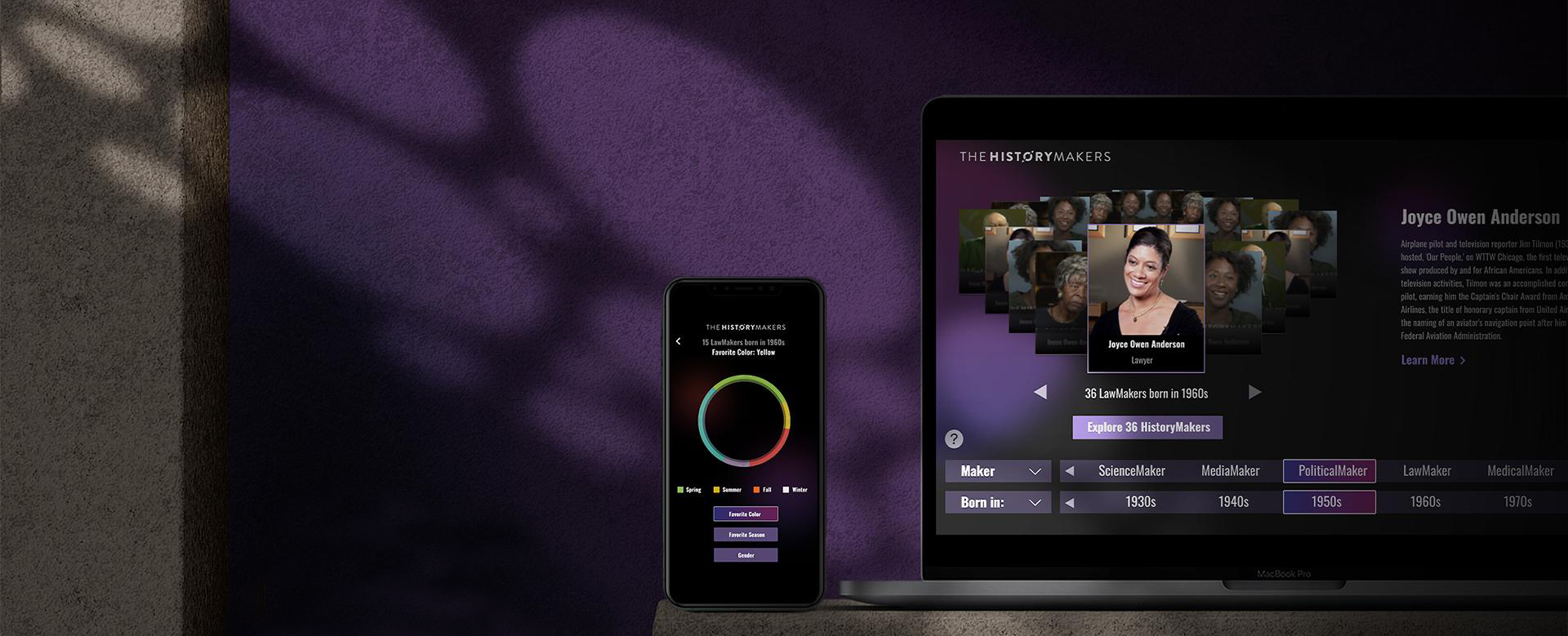
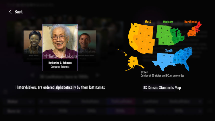
Overview - Manipulate distribution of subset based on an
additional option. This is for people who are more interested
in viewing the HistoryMakers as a set of people and want to
play with the data more.

Wireframe

After meeting with clients, I clearly knew their goals,
but our clients didn’t have a specific requirements.
During the design process, I showed a variety of design
solutions and tested them to improve the experience process.
Learning from my mistakes, the balance between the needs
of customers and users has been found.
but our clients didn’t have a specific requirements.
During the design process, I showed a variety of design
solutions and tested them to improve the experience process.
Learning from my mistakes, the balance between the needs
of customers and users has been found.

02 - 04
User Testing
Does It Actually Work?
My design process is one week sprints(Playtest and Client Meeting)
this way could think through lots of design decision
in depth based on feedback.

Change 1 # Advance Filter
Before Testing
After Testing

User can only see one option at a time so they have to click through all the options to find what they want.
Made the filters flst stripes (keeping the dragging component) to show multiple options once a time.
Change 2 # Image Click Event
Before Testing
After Testing
Most users tried to click the biggest tile in the center unconsciously. They wanted to learn more about this person, but actually the information is on the right side. Our assumption is that people’s attention are all cut off by the ring and ignored the information on the side.
I added the fade in and fade out effect to the biography information so that the animation will catch the user's attention.
Change 3 # Help Button
Before Testing
After Testing
I thought yellow was a more striking color to guide the user. It turned out that users were more sensitive to color than I thought.Too many colors will confuse them.
Keep consistency by using color.
03
Getting Started
Much of Archive Dive was about finding juicy moments to reward young users who didn't know
these people. A clean UI that was consistent and reduced barriers to use such as frustration and
confusion and invited the users in to "play" with data for Archive Dive.
these people. A clean UI that was consistent and reduced barriers to use such as frustration and
confusion and invited the users in to "play" with data for Archive Dive.